Introducing Bootcards: Bootstrap Cards Made Easy
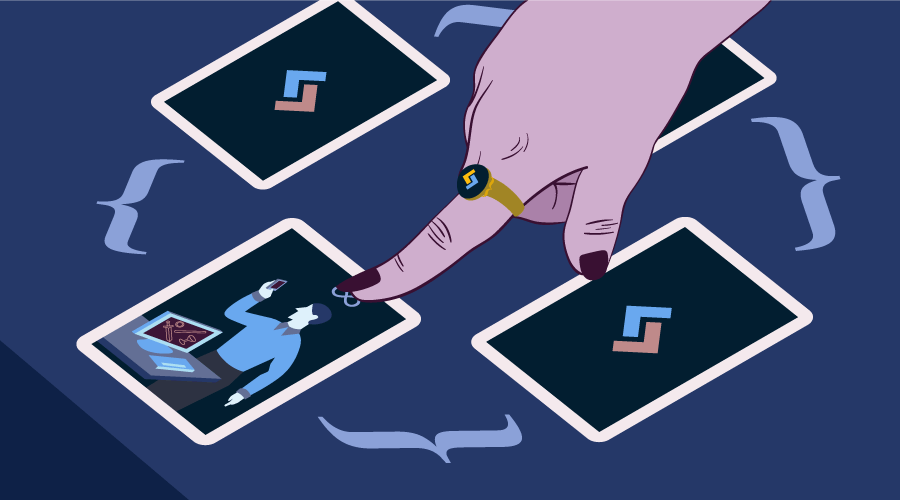
Bootcards is a UI framework for card interfaces. Like its name says, it is based on the Bootstrap framework and it has a dual-pane capability for both desktop and mobile.
These days information is everywhere and sometimes the sheer amount of it can confuse us. With the rise of mobile devices, UX designers have been trying to create interfaces that are minimalistic and don’t overload users with information.
Cards interfaces have been gaining lots of popularity, mainly because they focus on what’s important and are graphically catchy.
Bootcards is mostly used on lists, Summary Cards, different type of File Cards, and Media Cards such as Twitter Cards. The framework is helpful when we want to create lists which contain more information than usual. Another use case for Bootcards relates to Summary Cards, which are a great way of creating card-based dashboards.
Why Cards
Cards are in fashion nowadays. They show exactly what users want by keeping the focus strictly on key points. You can use cards to display contact details, summaries, file information, and more. This pattern breaks the content into small components and arranges them in eye-catching designs.
A lot of big names such as Google, Spotify, Pinterest and Amazon have used cards in their designs, especially in mobile devices. Cards gained importance when they got used for the first time by Twitter. Twitter Cards were presented in 2012 and since then the hype has gone up.
A cards-based layout consists of text, images, videos and more, all of which creates a valuable mix of information. Twitter uses cards to create a connection between users and content: users can quickly spot the summary that is important to them without having to go through the entire content. One more good reason for using Twitter Cards is to drive engagement to your Tweets.
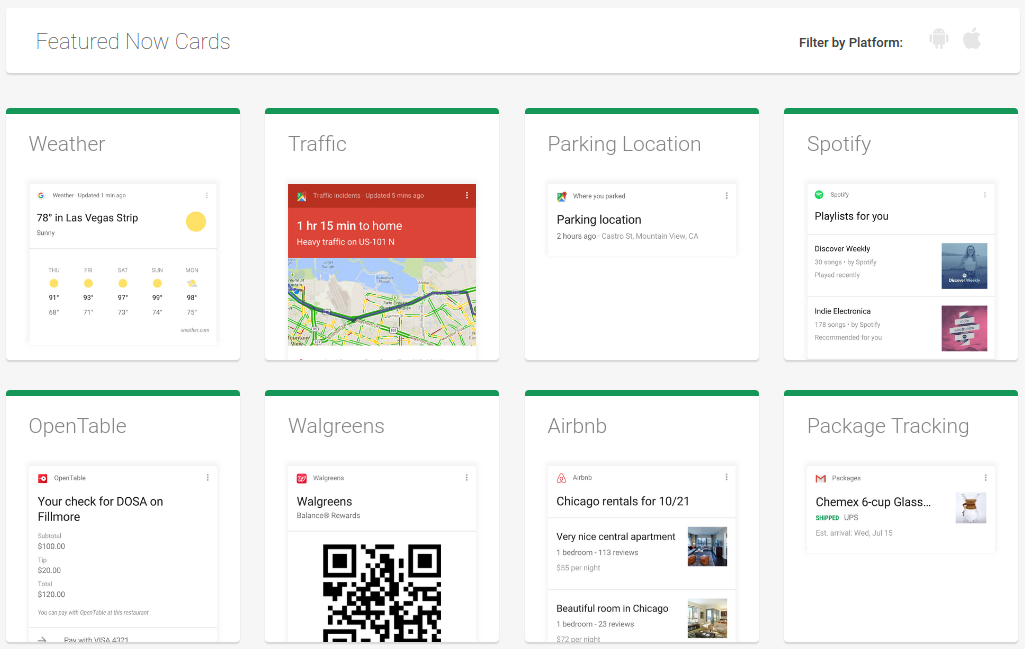
The Google Now Cards‘ slogan is to give the right information at the right time. Google Now Cards accomplish this by showing only valuable information with a focus on the needs of mobile users.
Bootcards offers a full set of features for creating high quality cards. The framework is optimized for all devices and media queries. Another good point is its native look and feel. It offers separate stylesheets for each platform: iOS, Android or Desktop.
Quick Start with Bootcards
In this section, we will learn how to create cards with the help of Bootcards. To get started, before adding Bootcards files, we need to add Bootstrap. Next, you can add Bootcards’ OS-specific CSS files (desktop, Android or iOS) and its JavaScript file.
The reason why Bootcards has OS-specific CSS files is to provide a UI that can change its look and feel depending on the platform that you are using. Different CSS files will change default heading colors, make the navbar collapsible and other UI changes. Be careful, you will only need to load one type of CSS file depending on the device being used to view your web page.
<link href="//maxcdn.bootstrapcdn.com/bootstrap/3.3.4/css/bootstrap.min.css" rel="stylesheet">


<link rel="stylesheet" href="//cdnjs.cloudflare.com/ajax/libs/bootcards/1.0.0/css/bootcards-ios.min.css">


<link rel="stylesheet" href="//cdnjs.cloudflare.com/ajax/libs/bootcards/1.0.0/css/bootcards-android.min.css">


<link rel="stylesheet" href="//cdnjs.cloudflare.com/ajax/libs/bootcards/1.0.0/css/bootcards-desktop.min.css">


<script src="//netdna.bootstrapcdn.com/bootstrap/3.2.0/js/bootstrap.min.js"></script>
<script src="//cdnjs.cloudflare.com/ajax/libs/bootcards/1.0.0/js/bootcards.min.js"></script>
You can start working with Bootcards just by adding its CSS files, but for enhanced usability, make sure you include the JavaScript function below:
bootcards.init(
  offCanvasBackdrop: true,
  offCanvasHideOnMainClick: true,
  enableTabletPortraitMode: true,
  disableRubberBanding: true
);
These options are especially useful if you are targeting mobile or iOS users. To show a backdrop when the offcanvas menu is displayed, set offCanvasBackdrop to true. In case you want to hide the offcanvas menu when you click outside it, you can use offCanvasHideOnMainClick. You can also enable single pane mode for tablets in portrait mode by setting the enableTabletPortraitMode to true. The last setting above, disableRubberBanding, is used to disable the rubber banding effect on iOS devices.
Create Better Cards
After we have set up the environment, we can start creating some sample cards. You can find these samples on GitHub, if you’d like to follow along. We will discuss the most used components of this framework and their purpose.
Detailed Lists and Base Card
The first Bootcards example we will build, is a contact list displaying companies details and a search form on top. The contact list will be enhanced when we click on company names. This list is built on two components: Detailed Lists and Base Cards.
Detailed Lists can be used to show the company names and some small details about them. If users want to learn more about a specific company, they can click the link on the Detailed List for that company to reveal the corresponding Base Card with the appropriate company details.
Base Cards are the best type of cards for detailed descriptions because they display the information in lists. Every list is separated by dividers.
Finally, Detailed Lists and Base Cards are inter-connected: in our demo, each company inside Detailed Lists displays its full info in its corresponding Base Card.
See the Pen Bootcards: Detailed Lists & Base Card by SitePoint (@SitePoint) on CodePen.
Media Cards
The second card we are going to create is a Twitter Card with a large image. We will use the Media Cards component for creating this card. Media Cards are used to display information containing text with images or videos.
But first let’s talk more about Twitter Cards. A Twitter Summary Card is designed to show a quick preview of the content to the reader. After users click on the Summary Card, they will be redirected to the card’s related content for more details.
Media Cards, like most other types of cards, are made of three areas: header, body and footer. The basic structure of a Media Card is shown below:
<div class="panel panel-default bootcards-media">
  <div class="panel-heading">....</div>
  <div class="panel-body"> ... </div>
  <img src="http://www.linkofphoto.com/path"/>
  <div class="panel-footer">...</div>
</div>
In our example of Twitter Card we have removed the panel-heading while leaving out the panel-body and the panel-footer components.
Most of the content is contained inside the panel-body div, where we have placed the card’s logo, header and main content. Instead, we have put the reply, retweet and like buttons in the footer area.
See the Pen Bootcards: Media Cards (Twitter Cards) by SitePoint (@SitePoint) on CodePen.
Summary Cards
Sometimes we need to create dashboards or structures based on tabs that represent information by using icons or logos. To display this sort of structures, the Bootcards framework uses Summary Cards.
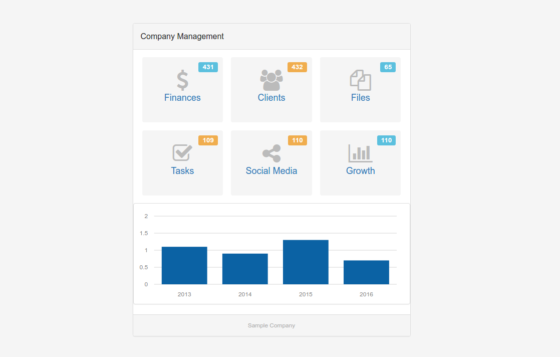
Summary Cards can be used with other types of cards. In our example, we have used Chart and Table Cards alongside Summary Cards. In this case, Summary Cards can be seen as the door to the information displayed by these other types of cards.
See the Pen Bootcards: Summary Cards by SitePoint (@SitePoint) on CodePen.
For creating Chart Cards in the Finances and Growth section, we have used Morris.js. It is very helpful for creating infographics and charts. So, in case you use Chart Cards in your project, don’t forget to add those files:
<link rel="stylesheet" href="https://cdnjs.cloudflare.com/ajax/libs/morris.js/0.5.1/morris.css">
<script src="https://cdnjs.cloudflare.com/ajax/libs/raphael/2.1.2/raphael-min.js"></script>
<script src="https://cdnjs.cloudflare.com/ajax/libs/morris.js/0.5.1/morris.min.js"></script>
File Cards
Another type of card that is very useful around the web is the File Card. The primary function of File Cards is to show information for PDFs, Word documents, spreadsheets and other non-media formats.
For downloadable files, File Cards are among the most attractive ways of displaying this functionality to users.
The structure of File Cards is composed of three sections: page-header, page-footer and list-group. The only difference with Media Cards is that instead of the .page-body class, it uses the .list-group class on the container element.
list-group is the space where we will put our supplementary content. Inside list-group we could put as many
<div class="list-group">
  <div class="list-group-item">content</div>
  <div class="list-group-item">content</div>
</div>
In our example we have used two list-group-items: one for the title name of the file, its type and its size, and another one for the description.
The footer section really makes File Cards interesting to look at. It contains three buttons which offer users the following options: download the file, save it for later or send it to someone with email.
See the Pen Bootcards: File Cards by SitePoint (@SitePoint) on CodePen.
The four Bootcards examples outlined here show some key features to better understand the framework and help you create your own cards.
Conclusion
Bootcards is a great framework which combines the cards concept with the power of Bootstrap. As long as use of mobile devices continues to grow and popular platforms like Google and Twitter keep using it, cards-based design will stay strong.

